Spriggan Powered for SFC
Review #2324
Spriggan Powered
The low-poly one
Gameplay
I hate it when a shooter doesn't have a continuous shot. In this one you must rapidly shoot. You can either press every couple of seconds, UN Squadron-style, or mash, but either way you can't just hold down the button.
There are four different weapons which can be upgraded a couple of times but which never become all that powerful. None of the guns are particularly useful either. There's a homing gun that fires up to 4 shots every second or two, a really narrow spread, and two more that fire straight forward. Obviously, the homing gun is by far the best, even though the fire rate is slow. But even so, it's generally good enough that you don't need to move around the screen all that much. As a result, the game is rather boring.
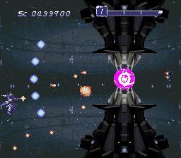
Tons of slowdown
Level Design
There's not much going on in any of the levels. It's just a wide open screen with only enemies to avoid. Unremarkable and unmemorable.
Theme
Mechs. I don't know much else.
Art Style
Looks like a game designed for the Saturn or PS1. You and most of the enemies have a low-poly, low texture look. It's ugly compared to the great pixel art of the time. The backgrounds have some business that's distracting and doesn't seem to match what's happening in the foreground. For example, in the first level the background features a landscape of moutains in the distance and a grassy field below it, but the field is a mode 7 layer that is moving towrad the bottom of the screen, giving the illusion that you're moving toward the mountains. Except you're not, because you're moving to the right, not into the distance. This is one of many examples of visual effects that are interesting to see but don't quite make sense.
It's also worth mentioning that both yours and enemy projectiles are VERY difficult to see against the similarly colored backgrounds. Everything is blah shade of grey or brown and it all runs together.
Audio
The music is fine, although it has no bass. It's way too high-pitched for my taste. Sound effects are good and don't drown out the music.


Comments
Post a Comment