Paladin's Quest for SNES
Review #407
Paladin's Quest
The other bad Enix game
Gameplay
Bare-bones RPG battle system. Strictly turn-based. No ATB here.
There's no magic points. Your HP acts as a shared pool for the two things, so it costs HP to cast any magic. Clunky.
Unbearably slow walking speed.
Very frequent random battles. Annoying, but necessary given the amount of grinding necessary and the slow walking speed. Not as bad as Secret of the Stars, but it's close.
You can hold down A rather than mashing which makes grinding a little less terrible, but only when facing a lone enemy. If there are multiple you have to use the d-pad to pick an enemy to target. Sigh
Level Design
I honestly didn't get very far, even after 2 hours of gameplay. There's just so much grinding required! I played with an easy hack which let me proceed much more quickly and I actually got into it a bit more. Unfortunately the dungeon and map designs are as bare bones as the gameplay. It's fine but nothing to get excited about.
Theme
Absolutely botched translation with stupid names for characters and, more importantly, for items. For example, the first two items you pick up are a "home dor" and a "learn h". There's no icon for either so good luck guessing that "learn h" is a Learning Hat that can be equipped to your head. Your first weapon is "Kn" (knife, obviously) and as a belt you come equipped with, uh, a "Minibl 9". This is absolutely the rule and not the exception so count on a whole bunch of confusing labels.
The story itself isn't terrible - it's the standard kid who wrecks the world has to save it trope that was done better in Secret of Mana, Illusion of Gaia, and Terranigma. It also assigns an age of 13 to you which is off-putting.
Art Style
Quite possibly the worst use of color I've ever seen. The artists used only pastel colors. Everything is painted in shades pink, beige, baby blue, and light green.
Sprites are flat, whispy things that look quite similar to those in Undertale. With minimal frames of animation they seem to snap from tile to tile.
The battle viewpoint is first-person with no view of your party members. The entire view is dominated by text within windows. It's...ugly.
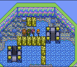
the world's design looks a bit like a Dr Seuss book.
Audio
Weird collection of good and downright awful tracks. The composer loved using off-key horns and sixteenth notes. On the whole this soundtrack is good but there are enough terrible songs that it brings down the package.


Comments
Post a Comment